from pandas_datareader import data
import pandas_datareader as pdr
import matplotlib.pyplot as plt
import datetime as dt
import pandas as pd
from pandas.plotting import register_matplotlib_converters

register_matplotlib_converters()  # Allow matplotlib have access to timestamp
import numpy as np
import scipy as sp
import yfinance as yf

plt.style.use("ggplot")
In financial or macroeconometrics, it is way more common to handle rate of change rather than level. For instance, we are more interested in the GDP growth rate rather than GDP level, or the change rate of stock index rather than its level.
Single and Multi- Period Return
Asset return in date \(t\) while holding only one period is
\[ 1+R_{t}=\frac{P_{t}}{P_{t-1}} \quad \text { or } \quad P_{t}=P_{t-1}\left(1+R_{t}\right) \]
Or simply, this is the single period simple return
\[ R_{t}=\frac{P_{t}}{P_{t-1}}-1=\frac{P_{t}-P_{t-1}}{P_{t-1}} \]
The return of holding assets for \(k\) period is denoted as \(R_t[k]\)
\[ \begin{aligned} 1+R_{t}[k]=\frac{P_{t}}{P_{t-k}}&=\frac{P_{t}}{P_{t-1}} \times \frac{P_{t-1}}{P_{t-2}} \times \cdots \times \frac{P_{t-k+1}}{P_{t-k}}\\ &=\left(1+R_{t}\right)\left(1+R_{t-1}\right) \cdots\left(1+R_{t-k+1}\right) \\ &=\prod_{i=0}^{k-1}\left(1+R_{t-i}\right) \end{aligned} \]
Or multiperiod simple return
\[ R_t[k]=\frac{P_t-P_{t-k}}{P_{t-k}} \]
Example
start_date = dt.datetime(2010, 1, 1)
end_date = dt.datetime.today()

df = yf.download(tickers=["AAPL", "AMZN", "NFLX", "A"], start=start_date, end=end_date)
df_c = df["Adj Close"]
[ 0% ][**********************50% ] 2 of 4 completed[**********************75%*********** ] 3 of 4 completed[*********************100%***********************] 4 of 4 completedChoose all the columns except \(\text{Agilent}\).
df_c.loc[:, df_c.columns != "A"].head()| Ticker | AAPL | AMZN | NFLX |
|---|---|---|---|
| Date | |||
| 2010-01-04 00:00:00+00:00 | 6.454505 | 6.6950 | 7.640000 |
| 2010-01-05 00:00:00+00:00 | 6.465665 | 6.7345 | 7.358571 |
| 2010-01-06 00:00:00+00:00 | 6.362821 | 6.6125 | 7.617143 |
| 2010-01-07 00:00:00+00:00 | 6.351057 | 6.5000 | 7.485714 |
| 2010-01-08 00:00:00+00:00 | 6.393279 | 6.6760 | 7.614286 |
df_c.plot(figsize=(12, 5))
plt.show()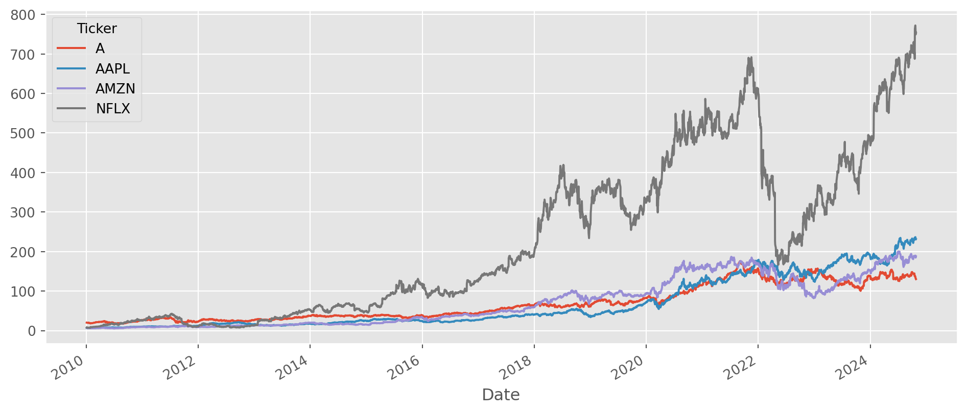
To calculate \(1\)-period return \(\frac{P_{t}}{P_{t-1}}\), just divide two columns.
(df_c.shift() / df_c).add_suffix("_simp_ret").plot(alpha=0.5, figsize=(15, 6))
plt.show()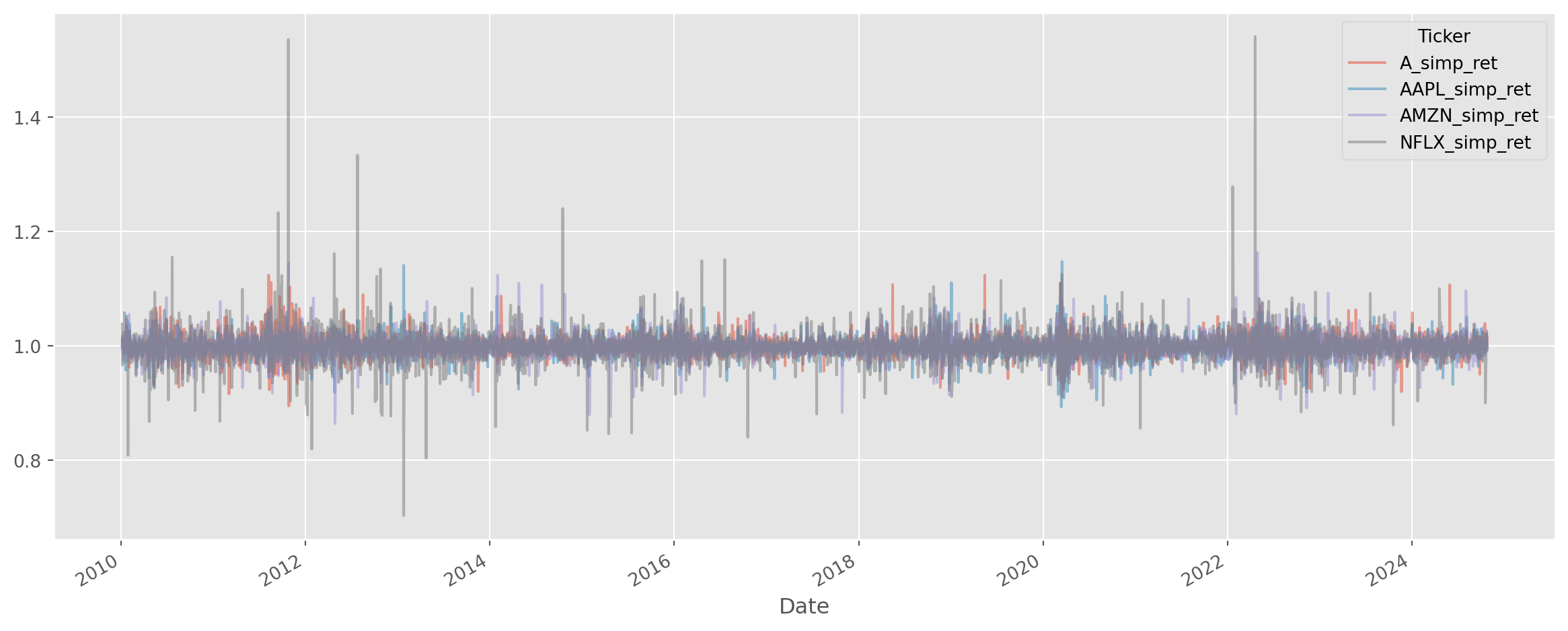
As for multiple period simple return, i.e. \(\frac{P_t}{P_{t-k}}\), a simple function is written to serve this purpose, which can be found in tseries_func.py.
def multi_period_return(df, k):
    df_kperiod = (df.shift(k) / df).add_suffix("_simp_ret_lag{}".format(k))
    df_kperiod.plot(alpha=0.5, figsize=(15, 6))
    plt.show()
    return df_kperiod
simp_ret = multi_period_return(df_c, 60)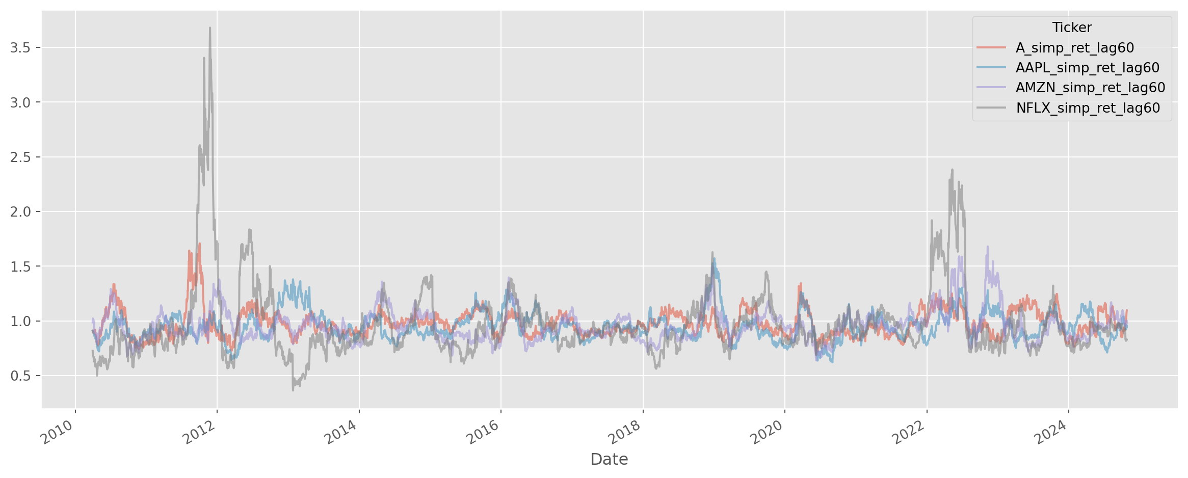
Continuous Compounding Return
The compounded return is given by the formula \[ C(1+\frac{r}{m})^m \] where \(C\) is the amount of capital at the beginning of the period, \(r\) is the annual interest rate, \(m\) is the times of paying interest.
As \(m\rightarrow\infty\), the formula become a continuous compounding, which can be proved to be \[ A = Ce^{rn} \] where \(n\) is the number of years.
def compound_disc(C, r, m):
    A = C * (1 + r / m) ** m
    return A


def compound_con(C, r, n):
    A = C * np.exp(r * n)
    return A
We can see in the plot below that as the periods approach to infinity, the discrete compound approach to the value that continuous formula has shown.
m = 50
A_comp_dis = []
for i in range(1, m + 1):
    A_comp_dis.append(compound_disc(100, 0.1, i))
A_comp_con = compound_con(100, 0.1, 1)

fig, ax = plt.subplots()
ax.plot(A_comp_dis, label="Discrete Compounding", color="DarkOrange")
ax.axhline(A_comp_con, label="Continuous Compounding", color="DodgerBlue")
ax.legend()
plt.show()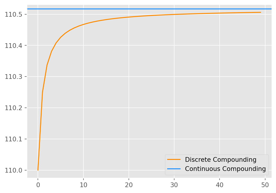
Log Return
The simple gross return of one-period is \(\frac{P_t}{P_{t-1}}\), taking a natural log, we call it log return.
\[ \ln(1+R_t)=\ln \frac{P_t}{P_{t-1}} = p_t - p_{t-1} = r_t \]
where \(\ln P_t = p_t\). A nice property of compounded log return is that
\[ \ln (1+R_{t}[k]) = \ln \left(\frac{P_{t}}{P_{t-1}} \times \frac{P_{t-1}}{P_{t-2}} \times \cdots \times \frac{P_{t-k+1}}{P_{t-k}}\right)=r_t + r_{t-1} + r_{t-2}+...+r_{t-k+1} \]
The formula shows that continuously compounded multiperiod return is the sum of continuously compounded one-period returns.
log_df_c = np.log(df_c)
df_log_ret = (log_df_c - log_df_c.shift()).add_suffix("_log_ret")df_log_ret.plot(alpha=0.5, figsize=(15, 6))
plt.show()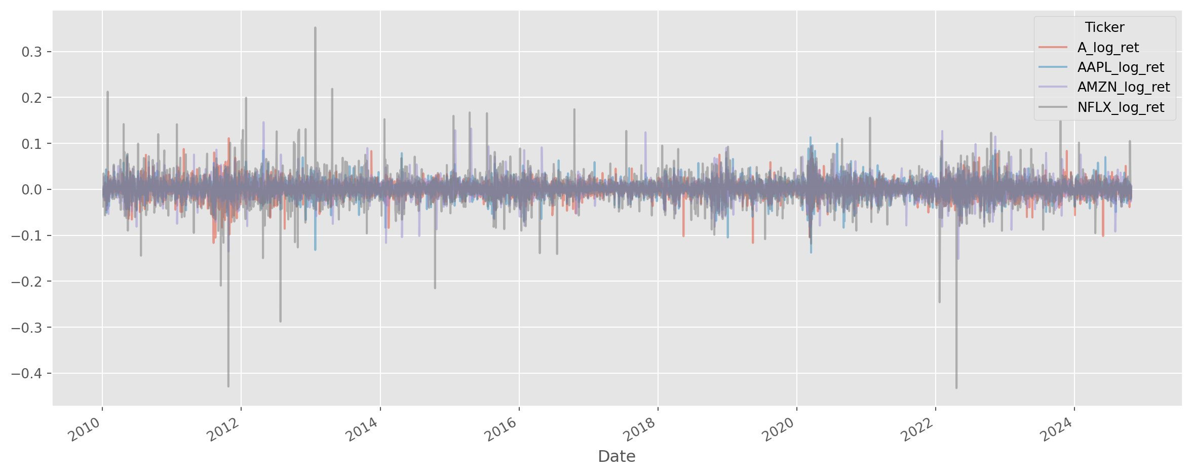
Converting Returns
The relationship between single-period simple return and single-period log return is \[ r_t = \ln(1+R_t) \]
The relationship between multiperiod compounded return and log return is \[ \begin{aligned} 1+R_t[k] &=\left(1+R_t\right)\left(1+R_{t-1}\right) \cdots\left(1+R_{t-k+1}\right), \\ r_t[k] &=r_t+r_{t-1}+\cdots+r_{t-k+1} \end{aligned} \]
Whenever you want to convert returns, make use of these formulae.
Why Taking Logs?
If a time series that exhibit consistent growth or decline, we call it nonstationary, taking natural logarithm is the standard practice in time series analysis. Suppose if \(y_t\) is an observation of the time series in period \(t\), the growth rate from period \(t-1\) is \[ g_t = \frac{y_t}{y_{t-1}}-1 \] where \(g_t\) is the growth rate. Rearrange and take natural log \[ \ln{(1+g_t)}=\ln{\bigg(\frac{y_t}{y_{t-1}}\bigg)}=\ln{y_t}-\ln{y_{t-1}} \] So the question is what is \(\ln{(1+g_t)}\)?
In calculus class, we have learned Taylor Expansion, which is the ultimate weapon for approximating any functions. \[ \ln (1+x)=x-\frac{1}{2} x^{2}+\frac{1}{3} x^{3}-\frac{1}{4} x^{4}+\ldots=\sum_{k=1}^\infty(-1)^{k+1}\frac{x^k}{k} \]
Because growth rates in economics or finance usually are small, we can retain the linear term from Taylor expansion, i.e. \[ \ln{(1+x)}\approx x \] which means log difference approximates the growth rate \[ \ln{y_t}-\ln{y_{t-1}} \approx g_t \]
Let’s take a look at real GDP per capita from US.
start = dt.datetime(1950, 1, 1)
end = dt.datetime.today()
df = pdr.data.DataReader(["A939RX0Q048SBEA"], "fred", start, end)
df.columns = ["R_GDP_PerCap"]
df["R_GDP_PerCap_tm1"] = df["R_GDP_PerCap"].shift(1)  # tm1 means t minus 1
df = df.dropna()
# pd.options.mode.chained_assignment = None # without this, possibly there will be error msg 'A value is trying to be set on a copy of a slice from a DataFrame.'
df["Gr_rate"] = df["R_GDP_PerCap"] / df["R_GDP_PerCap_tm1"]
df["Gr_rate"] = df["Gr_rate"] - 1
df.head()| R_GDP_PerCap | R_GDP_PerCap_tm1 | Gr_rate | |
|---|---|---|---|
| DATE | |||
| 1950-04-01 | 15977.0 | 15559.0 | 0.026865 |
| 1950-07-01 | 16524.0 | 15977.0 | 0.034237 |
| 1950-10-01 | 16764.0 | 16524.0 | 0.014524 |
| 1951-01-01 | 16922.0 | 16764.0 | 0.009425 |
| 1951-04-01 | 17147.0 | 16922.0 | 0.013296 |
However, as you have seen in previous tasks, a convenient method .pct_change can return the rate of change.
df["Gr_rate_pandas"] = df["R_GDP_PerCap"].pct_change()Exact the same results as manual calculation.
df.head()| R_GDP_PerCap | R_GDP_PerCap_tm1 | Gr_rate | Gr_rate_pandas | |
|---|---|---|---|---|
| DATE | ||||
| 1950-04-01 | 15977.0 | 15559.0 | 0.026865 | NaN |
| 1950-07-01 | 16524.0 | 15977.0 | 0.034237 | 0.034237 |
| 1950-10-01 | 16764.0 | 16524.0 | 0.014524 | 0.014524 |
| 1951-01-01 | 16922.0 | 16764.0 | 0.009425 | 0.009425 |
| 1951-04-01 | 17147.0 | 16922.0 | 0.013296 | 0.013296 |
Now calculate the log difference.
df["Gr_rate_log_approx"] = np.log(df["R_GDP_PerCap"]) - np.log(df["R_GDP_PerCap_tm1"])The charts below shows the difference between division growth rate \(g_t = \frac{y_t}{y_{t-1}}-1\) and log difference growth rate $_t- $
fig, ax = plt.subplots(nrows=3, ncols=1, figsize=(14, 12))
ax[0].plot(df["Gr_rate"])
ax[0].set_title("US GDP per Capita Growth Rate By Division Approach")

ax[1].plot(df["Gr_rate_log_approx"])
ax[1].set_title("US GDP per Capita Growth Rate By Division Approach")

ax[2].plot(df["Gr_rate"] - df["Gr_rate_log_approx"])
ax[2].set_title("Difference Between Division And Natural Log Approach")
plt.show()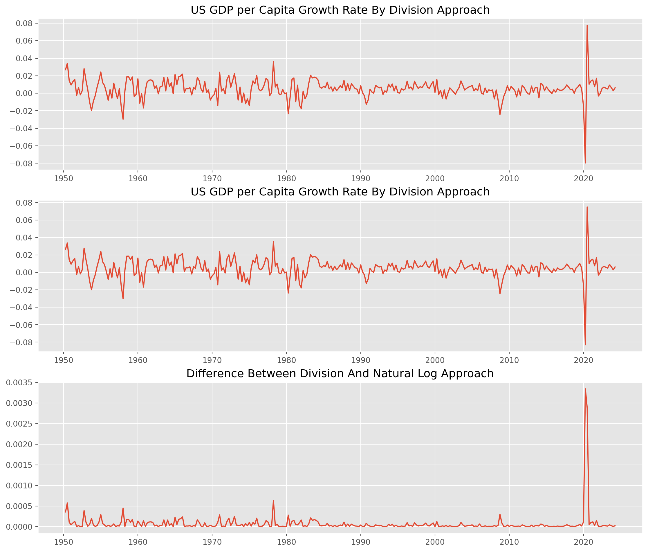
Also the log difference growth rate will consistently underestimate the growth(change) rate, however the differences are negligible, mostly are under \(5\) basis points, especially post 1980s period, the log difference grow rate approximate real growth rate considerably well. The only exception is the rebound during Covid pandemic, more than \(40\) basis points (\(0.04\%\)).
How Reliable Is The Natural Log Transformation?
We create a series from \(0\) to \(.8\) with step of \(.01\), which means the growth rate ranging from \(0\%\) to \(80 \%\) with step of \(1\%\). The first plot is the comparison of division and natural log approach, as they increase the discrepancy grow bigger too, the second plot is the difference of two approaches.
As long as growth(change) rate is less than \(20\%\), the error of natural log approach is acceptable.
g = np.arange(0, 0.8, 0.01)
log_g = np.log(1 + g)

fig, ax = plt.subplots(nrows=1, ncols=2, figsize=(16, 8))
ax[0].plot(g, g, label="Division Approach")
ax[0].plot(g, log_g, label="Natural Log Approach")
ax[0].set_xlabel("Real Growth Rate")
ax[0].set_ylabel("Approximated Growth Rate")
ax[0].legend()

ax[1].plot(g, g - log_g, ls="--", lw=3, label="Difference Between Two Approaches")
ax[1].legend()
plt.show()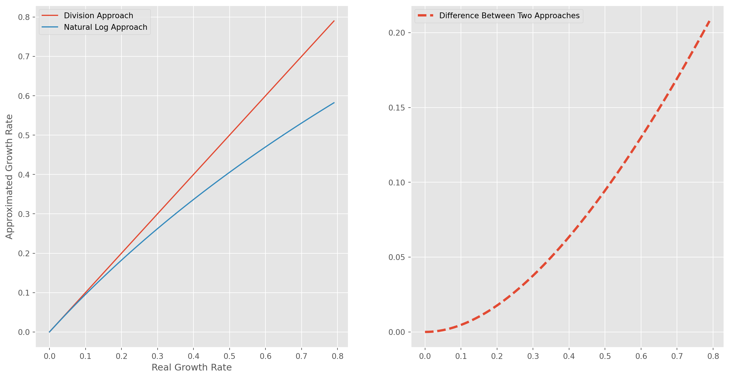
Inflation-Adjusted Return
Distribution of Returns, Kurtosis and Skewness
Before plotting the distribution of returns, there are two statistics to refresh.
SciPy use excess kurtosis rather than kurtosis, thus the standard normal distribution has kurtosis of \(0\), not \(3\)! Positive value means heavy-tailed, negative means light-tailed.
pd.DataFrame(df_c.pct_change().kurtosis(), columns=["Kurtosis"])| Kurtosis | |
|---|---|
| Ticker | |
| A | 4.594347 |
| AAPL | 5.164530 |
| AMZN | 6.308427 |
| NFLX | 23.845211 |
As for the skewness, positive value means skew to the right. From the info of skewness, Netflix was probably the most profitable one.
pd.DataFrame(df_c.pct_change().skew(), columns=["Skewness"])| Skewness | |
|---|---|
| Ticker | |
| A | -0.202201 |
| AAPL | -0.041022 |
| AMZN | 0.263291 |
| NFLX | 0.380210 |
Plot the histogram of the one-day simple return of three stocks.
fig = plt.figure(figsize=(12, 4))
stocks = ["AAPL", "AMZN", "NFLX"]
for i in range(3):
    ax = fig.add_subplot(1, 3, i + 1)
    ax.hist(df_c.pct_change().dropna()[stocks[i]], bins=50, color="LightCoral")
    ax.set_title(stocks[i])
# fig.tight_layout(pad=1.0)
fig.tight_layout()  # subplot spacing
plt.suptitle("Simple Return Distributions", x=0.5, y=1.04, size=18)
plt.show()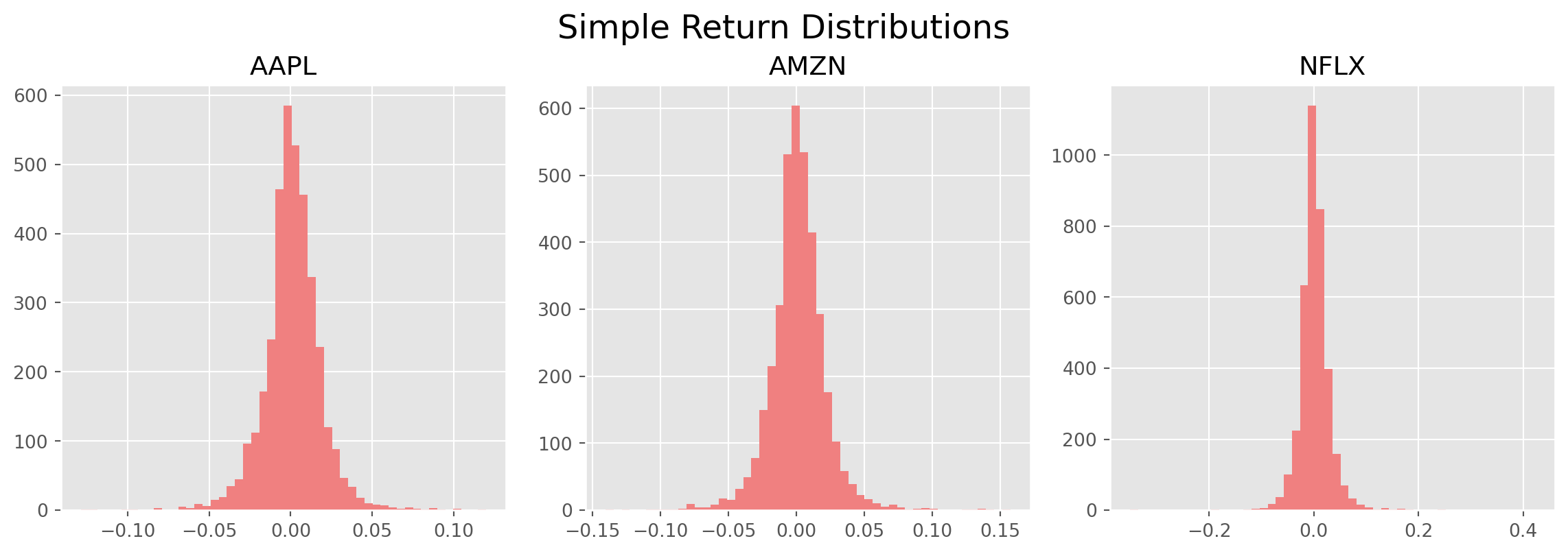
fig = plt.figure(figsize=(12, 4))
stocks = ["AAPL", "AMZN", "NFLX"]
for i in range(3):
    ax = fig.add_subplot(1, 3, i + 1)
    ax.hist(
        (log_df_c - log_df_c.shift()).dropna()[stocks[i]], bins=50, color="DodgerBlue"
    )
    ax.set_title(stocks[i])
fig.tight_layout()  # subplot spacing
plt.suptitle("Log Return Distributions", x=0.5, y=1.04, size=18)
plt.show()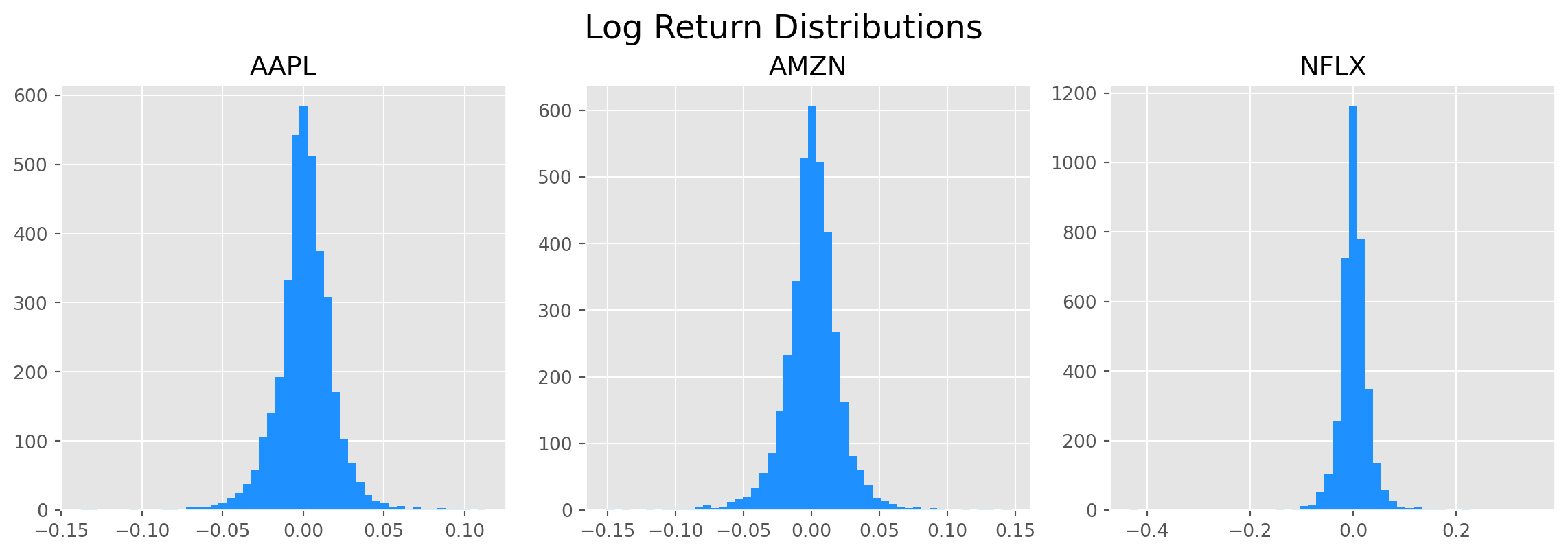
Visually, the log returns are more normally distributed, and the statistics show that log return are also less heavy-tailed and less skewed.
pd.DataFrame(df_log_ret.kurtosis(), columns=["Kurtosis"])| Kurtosis | |
|---|---|
| Ticker | |
| A_log_ret | 4.797105 |
| AAPL_log_ret | 5.416553 |
| AMZN_log_ret | 6.041537 |
| NFLX_log_ret | 29.482991 |
pd.DataFrame(df_log_ret.skew(), columns=["Skewness"])| Skewness | |
|---|---|
| Ticker | |
| A_log_ret | -0.380629 |
| AAPL_log_ret | -0.232929 |
| AMZN_log_ret | 0.013505 |
| NFLX_log_ret | -0.940289 |
\(t\)-test for Mean of Sample
We want to test some hypotheses, if sample means of log return statistically different from zero
\[ H_0:\quad \mu_0 = 0\\ H_1:\quad \mu_0\neq 0 \]
The \(t\)-test is constructed by
\[\begin{equation} t = \frac{\bar{x}-\mu_0}{s/\sqrt{n}} \end{equation}\]
df_c_desc = df_c.describe() # descriptive statisticsstocks = ["AAPL", "AMZN", "NFLX"]
for i in range(3):
t = df_c_desc.loc["mean", stocks[i]] / (
df_c_desc.loc["std", stocks[i]] / np.sqrt(df_c_desc.loc["count", stocks[i]])
)
s = "t-statistic of stock " + stocks[i] + " is {0:.4f}."
print(s.format(t))t-statistic of stock AAPL is 63.2116.
t-statistic of stock AMZN is 71.6145.
t-statistic of stock NFLX is 68.5835.We can of course use SciPy built-in function. The minor difference is caused by some unbiased adjustification in SciPy.
H0 = 0
stocks = ["AAPL", "AMZN", "NFLX"]
for i in range(len(stocks)):
    t, pvalue = sp.stats.ttest_1samp(df_c_desc.dropna()[stocks[i]], popmean=H0)
    s = "t-statistic of stock " + stocks[i] + " is {0:.4f} and p-value is {1:.4f}%."
    print(s.format(t, pvalue * 100))
t-statistic of stock AAPL is 1.1692 and p-value is 28.0609%.
t-statistic of stock AMZN is 1.1593 and p-value is 28.4341%.
t-statistic of stock NFLX is 1.5541 and p-value is 16.4104%.However, the implications are the same: the data of AAPL, AMZN, NFLX and TSLA rejected \(H_0: \mu = 0\).
Change of Frequency
We have seen how to upsample or downsample frequency in previous chapter, here we will use the characteristics of log return to change the frequency of the series.
df_log_ret_monthly = df_log_ret.groupby(
    [df_log_ret.index.year, df_log_ret.index.month]
).sum()df_log_ret_monthly.head()| Ticker | A_log_ret | AAPL_log_ret | AMZN_log_ret | NFLX_log_ret | |
|---|---|---|---|---|---|
| Date | Date | ||||
| 2010 | 1 | -0.110343 | -0.108215 | -0.065505 | 0.151851 |
| 2 | 0.115441 | 0.063347 | -0.057520 | 0.059254 | |
| 3 | 0.089049 | 0.138431 | 0.136894 | 0.110133 | |
| 4 | 0.052949 | 0.105280 | 0.009748 | 0.293564 | |
| 5 | -0.113792 | -0.016256 | -0.088724 | 0.116771 |
Rename the multi-index.
df_log_ret_monthly.rename_axis(index=["Year", "Month"], inplace=True)The log return from Jan 2010 to today.
df_log_ret_monthly.sum()Ticker
A_log_ret 1.870615
AAPL_log_ret 3.579413
AMZN_log_ret 3.334176
NFLX_log_ret 4.592896
dtype: float64(
df_log_ret_monthly.iloc[-1] - df_log_ret_monthly.loc[2010, 1]
) / df_log_ret_monthly.loc[2010, 1]Ticker
A_log_ret 0.176918
AAPL_log_ret -0.936724
AMZN_log_ret -1.122403
NFLX_log_ret -0.591326
dtype: float64df_log_ret_monthly.plot(figsize=(12, 5))
plt.show()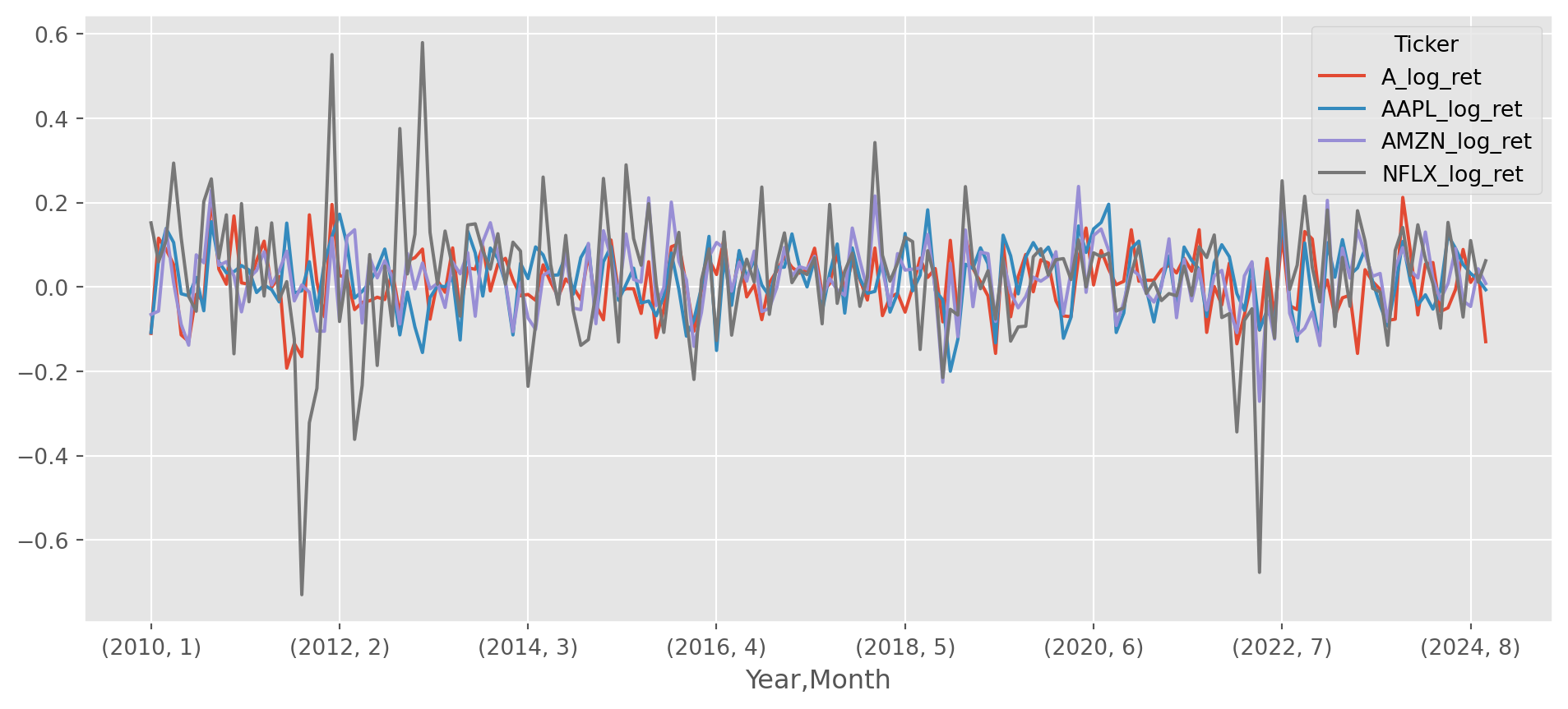
Example of FX
We can import FX rate from FRED.
start = dt.datetime(1950, 1, 1)
end = dt.datetime.today()
FX = [
    "EURUSD",
    "USDCNY",
    "USDJPY",
    "GBPUSD",
    "USDCAD",
    "USDKRW",
    "USDMXN",
    "USDBRL",
    "AUDUSD",
]

df = data.DataReader(
    [
        "DEXUSEU",
        "DEXCHUS",
        "DEXJPUS",
        "DEXUSUK",
        "DEXCAUS",
        "DEXKOUS",
        "DEXMXUS",
        "DEXBZUS",
        "DEXUSAL",
    ],
    "fred",
    start,
    end,
)
df.columns = FX
df_log_return = np.log(df) - np.log(df.shift(1))df_log_ret_des = df_log_return.describe()
df_log_ret_des| EURUSD | USDCNY | USDJPY | GBPUSD | USDCAD | USDKRW | USDMXN | USDBRL | AUDUSD | |
|---|---|---|---|---|---|---|---|---|---|
| count | 6215.000000 | 10471.000000 | 12952.000000 | 12958.000000 | 12966.000000 | 10416.000000 | 7449.000000 | 7180.000000 | 12949.000000 |
| mean | 0.000019 | 0.000109 | -0.000069 | -0.000022 | 0.000010 | 0.000034 | 0.000188 | 0.000154 | -0.000032 |
| std | 0.005759 | 0.005017 | 0.006263 | 0.005854 | 0.004088 | 0.006399 | 0.008649 | 0.009779 | 0.006740 |
| min | -0.030031 | -0.024295 | -0.056302 | -0.081694 | -0.050716 | -0.132217 | -0.179693 | -0.089508 | -0.192451 |
| 25% | -0.003105 | -0.000081 | -0.002858 | -0.002909 | -0.001818 | -0.001451 | -0.003451 | -0.004181 | -0.002522 |
| 50% | 0.000000 | 0.000000 | 0.000000 | 0.000052 | 0.000000 | 0.000000 | -0.000161 | 0.000087 | 0.000000 |
| 75% | 0.003148 | 0.000048 | 0.003008 | 0.002947 | 0.001803 | 0.001311 | 0.003257 | 0.004369 | 0.002852 |
| max | 0.046208 | 0.405459 | 0.062556 | 0.045885 | 0.038070 | 0.136451 | 0.193435 | 0.114410 | 0.066666 |
df_log_return["USDCNY"].idxmax()Timestamp('1994-01-03 00:00:00')df_log_return.plot(figsize=(15, 5))
plt.show()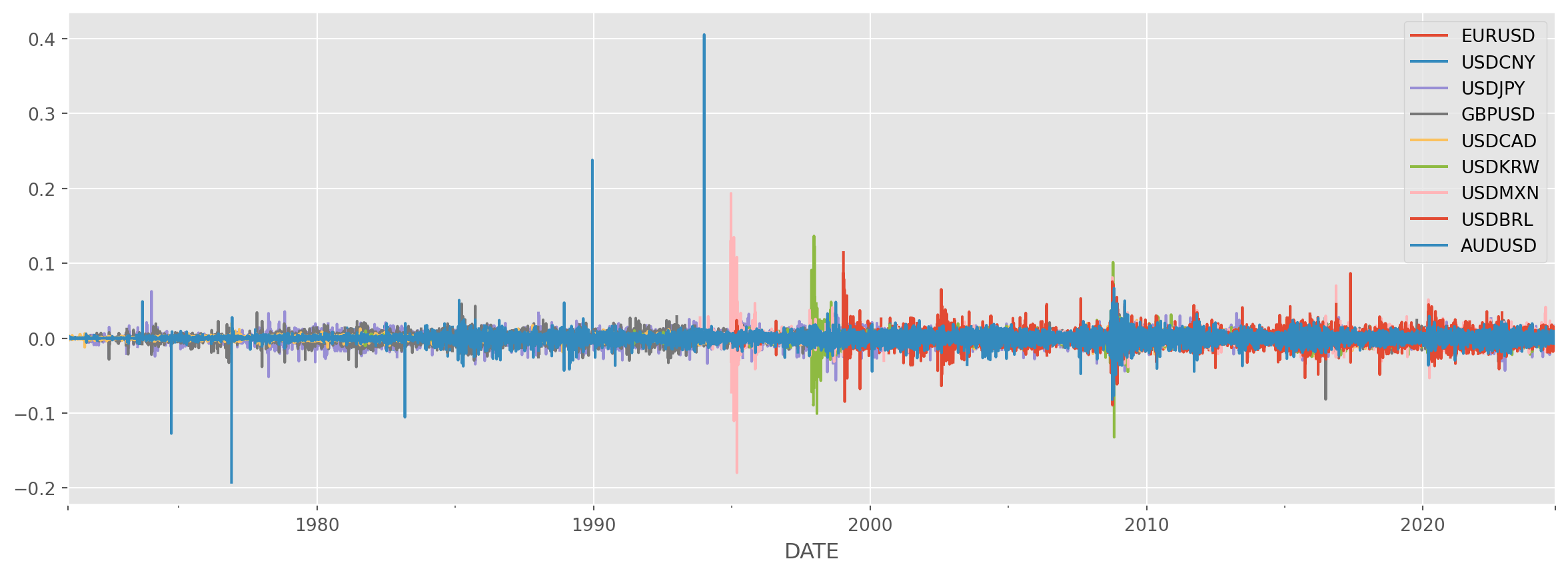
If you are wondering why CNY depreciated so much in the beginning of 1994, here is the answer: Chinese govt unified their dual exchange rates system by aligning official and swap center rates, officially devaluing the yuan by 33 percent overnight to 8.7 to the dollar as part of reforms to embrace a ‘socialist market economy’.
Now let’s plot the log return distribution, they are much more regular than stock returns. Very likely they are closer to normal distribution.
fig = plt.figure(figsize=(12, 9))
FX = [
    "EURUSD",
    "USDCNY",
    "USDJPY",
    "GBPUSD",
    "USDCAD",
    "USDKRW",
    "USDMXN",
    "USDBRL",
    "AUDUSD",
]
for i in range(9):
    ax = fig.add_subplot(3, 3, i + 1)
    ax.hist(df_log_return.dropna()[FX[i]], bins=70, color="LightCoral")
    ax.set_title(FX[i])
fig.tight_layout()  # subplot spacing
plt.suptitle("Log Return Distributions of some FX Rate", x=0.5, y=1.04, size=18)
plt.show()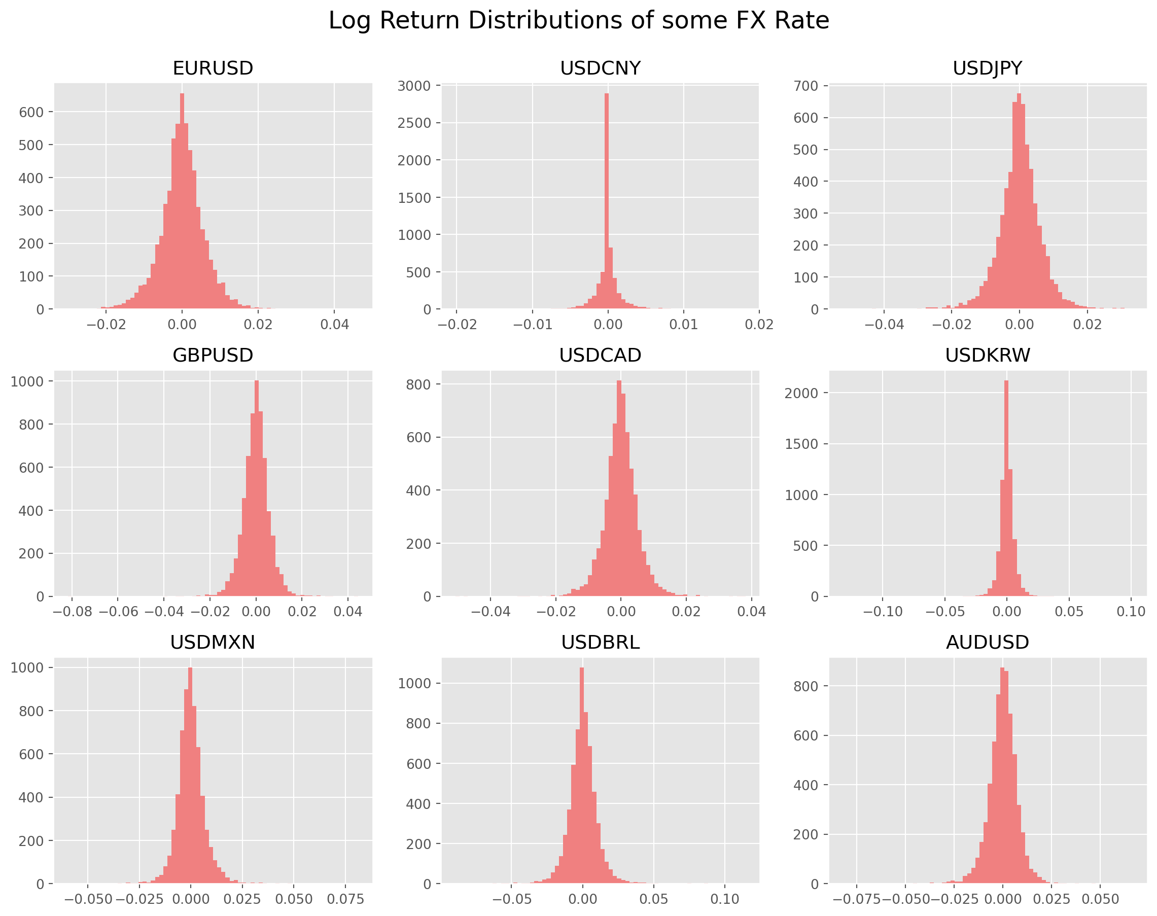
It turns out that EM FX rate return are much more heavy-tailed than stock return.
pd.DataFrame(df_log_return.kurtosis(), columns=["Kurtosis"])| Kurtosis | |
|---|---|
| EURUSD | 2.578487 |
| USDCNY | 4554.434237 |
| USDJPY | 5.818921 |
| GBPUSD | 6.955012 |
| USDCAD | 9.512779 |
| USDKRW | 96.027111 |
| USDMXN | 89.305943 |
| USDBRL | 12.495619 |
| AUDUSD | 75.663272 |
The interpretation of skewness of FX is bit different than stocks, the positive numbers means the quote currency (e.g. EURUSD, EUR is base, USD is quote) have shown more tendency of depreciation in the past, i.e. more days of depreciation than appreciation.
pd.DataFrame(df_log_return.skew(), columns=["Skewness"])| Skewness | |
|---|---|
| EURUSD | 0.147076 |
| USDCNY | 60.595860 |
| USDJPY | -0.418437 |
| GBPUSD | -0.297126 |
| USDCAD | -0.095981 |
| USDKRW | 1.345415 |
| USDMXN | 1.911615 |
| USDBRL | 0.410101 |
| AUDUSD | -3.142785 |
Check the \(t\)-statistics, null hypothesis is rate of change is \(0\).
FX = [
    "EURUSD",
    "USDCNY",
    "USDJPY",
    "GBPUSD",
    "USDCAD",
    "USDKRW",
    "USDMXN",
    "USDBRL",
    "AUDUSD",
]
for i in range(9):
    t = df_log_ret_des.loc["mean", FX[i]] / (
        df_log_ret_des.loc["std", FX[i]] / np.sqrt(df_log_ret_des.loc["count", FX[i]])
    )
    s = "t-statistic of " + FX[i] + " is {0:.4f}."
    print(s.format(t))
t-statistic of EURUSD is 0.2581.
t-statistic of USDCNY is 2.2230.
t-statistic of USDJPY is -1.2488.
t-statistic of GBPUSD is -0.4212.
t-statistic of USDCAD is 0.2780.
t-statistic of USDKRW is 0.5475.
t-statistic of USDMXN is 1.8711.
t-statistic of USDBRL is 1.3333.
t-statistic of AUDUSD is -0.5477.